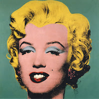
 |
| Andy Warhol print |
As I said earlier I want to edit my poster photo, to make a bigger impact on the audience. The poster needs to stand out so people notice it. I decided to keep to the super hero theme and edit the photo into a screen printing style photo. Similar to an andy Warhol effect.
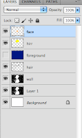 |
| layers |
There is some automatic effects you can use to make a cartoon style on your photo. But none are very good for altering to your needs, so I had to do this manually. I found a tutorial on youtube (at bottom of post) that taught me how to do this.
It required me firstly to alter the saturation of the image in black and white, to make the black and white contrast more. I than had to create new layers for each feature (face, cape, hair) and color these in the color I wanted. I than had to multiply the layers, so the black and white contrasted appeared under neither.
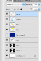 |
| layers |
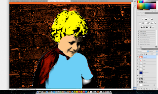 |
| screen shot of editing screen |
When I had finished doing this I had than to perfect it. Making more layers to fill in the small bits of color missing from the photo. This whole process was a challenge as I have not used photoshop very much before. But I did, in the end, manage to get the effect I wanted.


No comments:
Post a Comment