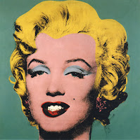
Thursday 8 December 2011

3 more ideas after audience feedback

After carrying out audience research people said they liek the second and the thir idea the most. People said that what was missing from the third, was some sort of prominent feautre, such as the birck wall or face. So i have re edited the third version twice, with these features in. I like all three ideas a lot as i feel they all have an impact on the audience. The first, could be slightly creepy, but i do like the way the character is completely animated. The second is good as I feel it suits the indie feel my target audience may like. And the third is goo as it has all the detail from the original. Below are my 3 final ideas for my poster. i have also put a poll that people can vote on to tell me which one to use.

Poster 1. Simple with brick back ground.

Poster 2. Simple with face detai.
Poster 3. All details.


4 Final poster ideas

After playing around with the tools on photo shop I have four different ideas to use in my video. They kind of go inorder of simplicity.

Poster 1 (original)

Poster 2 Cartoon with facila features

Poster 3 no features

Poster 4, most simple


I Now just need to make a decision on which one i will use. i will carry out some feedback to m`ke this decision.

Editing my poster

Andy Warhol print
As I said earlier I want to edit my poster photo, to make a bigger impact on the audience. The poster needs to stand out so people notice it. I decided to keep to the super hero theme and edit the photo into a screen printing style photo. Similar to an andy Warhol effect.
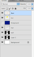
layers
There is some automatic effects you can use to make a cartoon style on your photo. But none are very good for altering to your needs, so I had to do this manually. I found a tutorial on youtube (at bottom of post) that taught me how to do this.
It required me firstly to alter the saturation of the image in black and white, to make the black and white contrast more. I than had to create new layers for each feature (face, cape, hair) and color these in the color I wanted. I than had to multiply the layers, so the black and white contrasted appeared under neither.
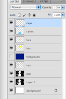

layers
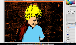
screen shot of editing screen
When I had finished doing this I had than to perfect it. Making more layers to fill in the small bits of color missing from the photo. This whole process was a challenge as I have not used photoshop very much before. But I did, in the end, manage to get the effect I wanted.


First draft of poster

I have completed the first draft of my movie poster. I completed it using photoshop elements which I am not very familiar with but i have managed to get the hang of a bit now.

Although finishing my idea for my poster their is somethings I do not like so am going to re design some of it.

  • I like the font a lot, but feel it does not match the style of the photo
  • The photo does not have the impact that I want for my poster to have, but, I do like the pose
  • The photo is slightly pixelated
  • I feel that the bad quality of the photo along with the brick wall in the background is too stereotypical of a low budget film. The brick wall background is slightly over sued in my opinion.
  • Due to color the billion block is not very visible
To fix my issues with the poster i do have some ideas. I am going to try putting some effects on the photo to make more of an impact, and to also make ti match the font a bit more. 

Tuesday 6 December 2011

Some last minute insperation


fictional newspaper from film

I was just watching the pixar cartoon 'The Incredibles'. During the film their is some sections whre the antagonists, who are super heros, are intervewied. The film also shows fictional newspapers headlines about the super heros. Although already almost finishing my film, this was helpful as it showed how super heros mnay be represented in the media if they were real. The opening sequence which I have posted is the section I am refering too, and I feel that it is a great paqrt of the film. This discovery has given me some inspiration for the final push of editing to meet the deadline.

Billing Block

I am currently making my billing block for my film poster. The billing block is a vital part of  a film poster. It is at the bottom of the poster and shoes the audience all the main people involve in the film,although very small and discrete, it is still vital that a film poster has one. I found an example of a billing block online that I could base mine on. In this billing block it uses a particular font so I searched online on dafonts.com for a suitable font. I found a font called Tall Films which looks right. On the billing block the production companies are listed as well as the actors and directors , etc., the names are in a larger font, whereas the connective words are in a smaller font. At the bottom there is a website address and also a logo for the production company. Below is the example I looked at. 


Example

My billing block will have less names on, but I have put fictional producers and writers names on it too make it look more realistic. Due to it being low budget it will not have as many names on it anyway. I have used my production logo at the bottom right and also put a fictional website address on the poster.
My billing block

Monday 5 December 2011

Final title idea

After looking at the poll results I Have decided on Micro Force: Caped and Crawling. I have combined two of my title ideas. In my poll i got some feedback saying that Caped and Crawling would make a good tag line. So I have decided to use this as a second part of the title using Micro Force as the first.

Thursday 1 December 2011

Title Poll. Please read description before answering .

I have come to the point where I now need to finalise my title for my film. I have thought of a number of different titles that I feel would fit the genre of the film and capture the audience’s attention. Although within the story my main character is a global star with a lot of media coverage, in reality he is not, so I need a title that will make people question and wonder what my film is about.  Please could you pick the title below that you think would most appropriate for my film? To help you, I have written a short synopsis of my film below. One option, Micro Force, I have chosen to fit the convention of superhero films. When a film is about superman it is called Superman, and the same with Spiderman etc.
My film is a mockumentary (fake documentary), that is an inside scoop into the life of a three year old super hero. Prior to the documentary being made he has huge media coverage and everyone wants to know about him. Until now no one has been able to secure an interview with him. But I have finally managed too. The documentary is an inside look at his life, involving sections of him, his side kick, and his fan club.


List of things too do

  1. Perhaps film 5-10 establishment shots for opening sequence of film
  2. Make 5 more news sites or blogs
  3. Upload video to youtube
  4. Film 30 seconds more Of Micro Force
  5. Finalize title
  6. Finalize poster idea

More Editing

I have now finished editing about half of my film. I have edited the last half completely, and will now start from the beginning before joining the two parts together. I am slowly running out of filler shots to use so their is the possibility of having to re shoot some scenes but even if ti do this will not be a lot of work, as it will about 30 seconds of footage needed.
Layers of my editing
In the editing today I carried on with what i was doing from last time, but i am find the amount of layers I have created quite hard to handle. Due to timings, it is easier to create layers, rather than trying to fit everything in perfectly, if I want something to come in at the right point, rather than trimming it I just put it on another layer. When editing the other half, I may try and do this less, as it is hard top keep organized with that many layers.

First Edit Feedback

I have carried out some audience feedback on my first edit in the from of questionnaires. The questionnaires are needed to help em make final decisions about my edit and make sure I make it fit my audience.  Although my first edit was only two minutes long I did receive some helpful feedback.
  • Change actor of fan club section as voice is too similar to voice over woman
  • Make last third of the appearing shot darker to make the switch less obvious
  • Add more shots of the characters daily life
  • Add some music
  • Make shots of fan club slightly brighter
Although my first edit was not very longer, some of these targets are applicable for my entire film so will be helpful whilst finishing the editing period.