Thursday 22 September 2011

I'm Still Here poster

I'm still here is a mockumentary by Casey Affleck about and staring the Joaquin Phoenix. The mockumentary follows Pheonix as he decided to leave the world of acting to become a hip hop artist.

The main feature of the poster is Joaquin phoenix;s face in the centre. He has a large beard and sung;asses on. Hiding most of his face, fitting the tile and the theme of disappearing from the acting industry. The outfit and expression of Phoenix, makes the poster look serious, not fake. Which is what I aim to do with my poster.

The simple grey background on the poster is fitting of the simplistic style of the poster, and also draws all the attention to phoenix.

The font of the poster is really good. It is slightly disappearing in some parts. This fits the themes of the film, and the title.

The very simplistic poster here is very fitting, and I feel markets the film,m very well. Fits the target audience, who are probably going to be very interested in films.

I feel the way that this mockumentary poster is presented as serious and not as a joke, is very good. This is something I want to do when I make my film poster.

Analysis Kick Ass Film Poster

I chose to analysis the Kick Ass poster as it links to the child super hero theme of my short film. The film was very successful in the box office, and I think the poster is very successful in advertising the film. Although a super hero film, the film does have some parody moments, sort of making fun of super hero films.

Features
The main feature of the poster is the main character in the centre. He is wearing an obvious super hero costume, but he is than wearing worker boots on is feet. This small touch of normality in his costume adds comedic value, and also gives hint of this story line- the fact he is  not a super hero.  This gives me ideas for my poster. As I want to add comedic value by adding hints to the fact that this is a fake documentary (e.g. giving my super hero a homemade looking costume).

The back ground of the poster is a red back drop with a blood spat directly behind the character. The crimson red back drop gives a heroic feeling to the poster. The blood stain makes the character look more like a super hero and fits super hero connotations.

The font of the writing on the front cover is very traditionally super hero style. fitting the themes of the film. The fact that such an obvious super hero font is used gives hint that this film is a sort of parody. As a serious super hero film in modern day would not use such an obvious font.

There is a small tag line above the title saying 'on april 2nd, get ready too', this than leads into the title of the film. This tag line grabs your attention and also gives you the release date of the film.

Monday 19 September 2011

Conventions of Documentary film making

The following are some leading conventions of documentary making:


Aim-The aim of a documentary is to inform. Also to record important recent events, to broaden opinions, and to gain interest from the public.

Voice over-Many documentaries involve voice overs. The film maker, or interveners voice that narrates the action. This voice can be spoken whilst filming, or recorded and added in the editing process. Through this voice over, the film maker can explain tot he viewer, the events and opinions on the seen action.

Interviews-An interview is very common in documentary making. It allows the main person in the documentary to give there views, and professionals opinions, prompted y the interviewer (weather or not the questions are heard by the viewer is down to the style the film maker pursues).  The interview in a documentary is important, as it adds realism to the documentary, and backs up the points the interviewer is making. To involve appropriate interview sections, the film maker may interview their subject for an hour, and only show 10 minutes of interview footage in the film. Making sure the footage they show is appropriate and needed to fit the them of the film.

Archive Footage-Some documentaries may involve archive footage, used to show the viewer the events that the documentary is about. Archive footage is valuable as a start to the documentary, especially if the documentary is about a current event, or current phenomenon.

Reconstruction-A reconstruction may be used to show the viewer about events that have happened in the past-such a documentary about WW1.

Montage-A montage sequence is sued to link word to action. Such as in an interview section. Whilst the subject is answering, the film maker may edit a series of shots the viewers can see, linking to the sound. A montage can also be used to show a change in time or location. Montages are also effective in triggering emotion.

Exposition- Exposition is a part at the start of a documentary that highlights what the documentary is going to be about.

Friday 16 September 2011

Blurring faces

Due to the documentary style of my film i will be exploring new techniques in editing.

My character, being a super hero, will have a secret identity. I will use this aspect, to use blurring faces in my short film- when the character is not ion his super hero costume, as to keep his 'secret identity'.

Blurring Still faces

I have explored how to blur still faces using final cut. I used a youtube tutorial to teach me how to do this suing final cut express.


This youtube tutorial was very helpful and I succeeded in blurring the short video of my face that I filmed. I did face some problems whilst doing this, and the tutorial highlighted some problems- such as how much blur I should use to make sure it is still obvious it is a face. I also realized a problem- I can not blur moving faces. below is my first video- blurring of a still face.

Moving Images
time line with time marks (green dots)
I have decided to try and now blur moving faces as this will make my documentary look more professional. I have found another tutorial on youtube, which was very helpful. The technique is similar, but it takes longer as you need to make time marks. These let you adjust the positioning and size of the blur for every second of the clip. This can take a long time, but is not to hard as long as the movement of what you are blurring is not to erratic.


Below is my attempt at blurring a moving object

Final Idea

My final idea is to make a mockumentary.

The Mockumentay will focus on a 3 year old super hero who has become an international sensation after someone filmed him stopping crime and posted it on youtube.

The purpose of the documentary is an exclusive inside look into this super hero's life, something that would be in demand, as my audience would be very exited to see what my characters life was like.

The Mocumentary will be half interview based, and have other footage. The other footage will include the original youtube clip which was the reason for hsi rise to fame, clips of him in his house and 'base'.

The main character is a child vigilante, similar to Hit Girl in Kick Ass. But the differences are that this character will be portrayed as non fiction character, and that this character also has actual super powers rather than just fighting skills.

One of the reason for this idea is that i feel doping a documentary style film, and due to the super hero content. This will allow me to explore a lot of new techniques whilst editing.

Tuesday 13 September 2011

Mockumentary style

On the wikipedia page for mockumentary it says 'A mockumentary (a portmanteau of the words mock & documentary), is a type of film or television show in which fictitious events are presented in documentary format.'

The type of mockumentary I will be doing is a sort of  'cinéma vérité', meaning a documentary that follows a eprson through certain events.

One of the earliest examples of a mockumentary style film is the 'Swiss spaggheti harvest', a news report that panorama brodcastest on april fools day in 1957. The news report fooled audeicnes that sphaetti grew on trees, after the broadcast the BBC received hundreds of calls, some asking where they could buy a spaghetti tree.
One example of a mokcumentary is Brass Eye- Cake. A TV show from channel 4. The Tv show was a mockumentary about a new fictional drug named Cake. The mockumentary, like most, are displayed a s a comedy. The comedy aspectis important as to make something funny, i want to make sure Iget the humour right. Normally mockumentary have a more dry style of humor, presented in The Office and Brass Eye which fits the older audience that I would like to aim my short film towards.

Mockumentary's also normally have a voice over (the interveiwer), for this I could use my own voice or I could audition several different voices to find a voice that suits the style. Finding the right voice is important, as it needs to fit the style and audioence of the film.


Thursday 8 September 2011

Some initial ideas

I have done a small amount of research into short films.

The first two i looked at both had strong story lines, whereas the third was abstract. i feel that between those two choices I would rather do an abstract short film.

there is also another genre I had thought of looking at, Mockumentary.

before deciding i will need to research into short film mockumentarys, and look at conventions before making my final decision.

Textual Analysis- SURFACE

Narrative Context
Surface does not have a strong narrative trail, there is no story to the short film. The film is an abstract piece which follows the daily acts of people, but from the grounds perspective. it is an experimental piece which uses sound and movement to create a very interesting watch for the viewer. The use of an under ground view is effective as it gives the audience a different perspective, and is also very interesting and enjoyable to watch.

In the film there are no characters that the audience form a relationship with, this is due to the view point,  this is useful, as it separates the audience from the characters- through being under the ground. The film is less about story and characters and more about aesthetics. There is one unknown character at the end, that forms the climatic moment. The character gets hit by a car, and the audience see it from beneath the road.

Although know location is obvious. What the audience can see give an urban feeling to the film, matching the music, and sort of festival this film may be entered too. The urban feeling, is created through the things you see being dropped on the ground, such as cigarettes and cans. And the hustle and bustle that goes on, such as lots of people walking, biking.   One part of the location that i thought was used particularly effectively, was the section where children are drawing with chalk on the ground. This part looks particularly good to the audience as the drawings out being drawn over the ground, therefore are closest thing to the camera.

Although the camera does not do very much changing in the film due to the odd view point, as some points the camera is used very effectively. Towards the end of the film, the shot is of a park, there is there jump cuts between shots getting further and further away, from  close up to an extreme long shot. This is effective as it matches the music, as well as gives a very impressive view of the park above.

The editing in the film is used brilliantly to add a fast pace to the film. The editing is is used to create an in since feeling with the music. Sounds such as cans crunching and footsteps are edited to link with the music, to create a beat-boxing style of song. Suiting the urban feeling of the film. The part when the boy gets hit by the car is edited very well, to from  quick series of events. The audience see a boy running, than year car noises, than there is a spot of blood on the screen. All these are e4dited quickly together to show a chaotic turn of events. The music than stops suddenly and you see the boy lying there., The music and the editing work together to create a section that is very visually interesting to the audience.

Due to the music and style of the film , I feel that the audience would be older teenagers, who are interested in film. The grey colours, and ambient music, create a style that would suit the younger generation more than the older generation.

Wednesday 7 September 2011

Textual Analysis: Post-it love

Narrative Context:
Post-it love is a 3 minute short film that follows the flirting of two office workers. The film starts where the two catch a glimpse of each other in the photo copying room. They than start to leave the other small pictures made of post it notes to prove there affection. The film ends with the female preparing to make big post-it picture for the male, but walks out to the lobby where the man has made a hugely impressive post-it portrait of the pair together.

Characters
The male and female characters are not delved into a lot by the film makers, due to the lack of dialogue. But the audience do find the characters both very endearing. both characters are quite shy, and this suits the very subtle and sweet nature of the film. The characters are both wearing office style clothing. But both also fitting a style that suits the film- slightly quirky, with bold pastel colors.


Location
The location is an office. The office seems very calm. At the start there is a photo on the wall of the office, the photo is of a tower block. This photo is well placed, as it gives the reader the impression that the tower block is in fact where the film is set. At the start the audience see a photocopying room. the room is basically symmetrical, with the girl on one side, and the boy on the other, the symmetrical room is effective here as it makes an obvious bond between the male and female. The film is set in several locations in the office- hallway, toilet, supply cuboared. the small areas that the characters are inj are effective, such as the supply cuboared. They add to the sweet coy feeling of the film. When the female is leaving the supply room with lots of post-its there is a sign on the wall saying 'Can you please make sure the stationary you take is solely for work purposes. Thank you' This adds comical value to the film.

Camera
At the start of the film there is a birds eye shot looking over the girl as she is using a photo copyer. The camera than moves across the room, staying in the birdseye postiton to reveal the male using a photo copyer. This is effective as it shows the similarities of the characters just byu there actions, and the camera form a sort of flirtation between them before the action has even begun. There is than a long shot, showing both characters from behind using the photo copyers. This shot is very simple, and suits the style of the film. the next two scenes start similarly, they are both shots of an empty office desk. Than one of the characters walks in and sits down, in the first the man, and in the second a woman. I found that the way that both scenes start similarly is effective. And they way the camera keeps a similar distance and frame for both is effective. At the end when the woman discovers the huge art the man has made for her. The camera is tracking the woman from in front, so she is walking towards it. When she stops walking, the camera zoomz out a lot. This shows the magnitude of what she has seen, before the audience actually see it.  When the woman goes into the supply room and see's another post-it art work, there is a close up of her eyes. This shows the reaction again- before the audienc see's the art.

Sound
There is no dialoige in this film. But I feel this aids the awkward flirting, as it makes the whole film more endearing. There is musicn throughout the film. The music sounds like marching music, manly played on brass instruments. This is really effective with keeping a steady pase throughout. It also suits the way the characters move and act. At one point when the female walks into her office, the musicm changes slightly, becomeing more light, and high pitched, this changes to show the sweet nature of the woman. The diegetic sound, such as the photocopyer at the start is very effective in setting the scene. Those noises, very much linked with everyday office work, emphasise how this romance is happening in such an average place.

i feel, that through the overall styling of the film, as well as the music, this film fits in a genre of awkward films. Not overally emoional, or funny. This film fits in a niche that is beocming very popular, the awkward comedy.

Textual Analysis: Blind Luck

Narrative Context
The Narrative begins with a young man (Matthew) sitting at a till in a small shop. he looks noticeably bored with his job. the Shop door bell than rings and an older man (David) with a walking stick walks in- showing the audience he is blind. The Man walks to the till and both characters greet the other by just saying the others first name. David puts a one pound copin on the till and pushes it towards Matthew. in silence Matthew than sells david a scratch card.  David than scratches the card and gives it to matthew to check for him. matthew looks at the card and see's that it is a winning card- of fifty thousand pounds. Matthew looks at david and says 'better luck next time', as Matthew leans in to take the card, David, thinking it is worth nothing grabs it and leaves the shop. Leaving matthew in the shop, behind the till.
Characters
Matthew- Matthew is the character who works in the shop. Instantly at the start of thew film it is obvious he is bored with his job. He looks quite scruffy, and he is showing that he does not want to be there. When David walks in, he doesn't greet him in a very customer friendly way, he just goes about the motions of doing his job. When Matthew realizes that David has won on the scratch card the audience see that he is faced with a dilemma. This dilemma is ultimately the point where Matthew proves to the audience if he is a good character or a bad character. When Matthew lies to David, we than see his shock when David destroys the card. This is a sort of karma for Matthews character after lying to David. Matthew represents an average young person living in the UK at the moment, and I feel that this film shows that a lot of people in his position would do the same as him.

David- Davids character is the vulnerable character in the film. Like Matthew, he seems to have a very routines life, shown when he does even need to ask for a scratch card at the till. Davids character is oblivious to what Matthew and the audience know in the film, but when he rips up his winning scratch card I found i felt more remorseful for Matthew than David, as David never knew what he could of won.

Location
The location is very simple, in a shop. The shop looks like an average newsagents or corner shop. I found that nothing in the shop stood out more than anything else, it was very neutral. If you did try and pay attention ti the background, you would see normal things such as batteries and magazines. There is also an england flag, messily hanging up on the ceiling, perhaps showing the audience about the class of the characters, and the area the film is set. The lighting in the shop is all very artificially bright, giving a very mundane feeling to the shop. linking with the attitudes of the characters.

Editing
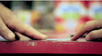
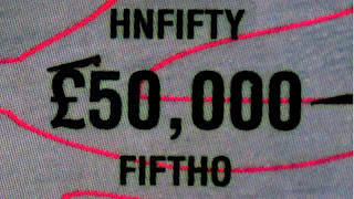
I found in this short, that the camera work is a lot more effective than the editing. When the two characters are at the till shot reverse shot is use, and over the shoulder shorts to show continuity, i found the slow continuity of the film, how everything is very long, adds to the 'everyday, normal' theme of the film. Showing the slow pace of the characters, The editing when both character are reaching for the lottery ticket is also effective. You see two hand reaching, but it is not un till the cut to next shot that you realize which man got the ticket. The slow pace of the shots, draw this out, and it is very sudden when you realize David tore the ticket up. the editing of the ticket, is effective when the camera goes from £50,000 to the next £50,000, the movement of the camera gives the section quite a novel feeling, similar to when you see casino's in comedy films.

Camera techniques
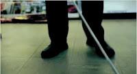
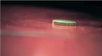
At the start of the film, the camera is out of focus on the wall behind the till. Than Matthew comes in view of the camera, himself on focus. The way that the camera keeps still is an effective way to reveal the character, it gives the start quite an awkward feeling. When David enters the shop, the shot is a low shot, just showing his feel and his walking stick, this is effective as it shows the audience straight away that David is blind, and it gives the film a slow pace. When David puts the coin on the counter, the camera is strongly focused on coin, and the background is blurry. The coin is on its side and the audience can see the Latin word decus on the side of the coin. Translated, this word means dignity and honor in English. This clearly links with the themes of the film, so the close up of the coin there is very effective. When Matthew realizes it is a winning card there is few straight close ups of the characters faces, firstly Matthews showing his reaction than Davids. the close up of Davids face is effective because it shows Matthews point of view, and the audience can see Matthew's decision making, deciding weather he can trick this old man. The medium shot of the tow hands reaching for the card is also effective, as it adds suspense to the film.
Sound
At the start and throughout there is ambient noise in the background. This Background noise, gives the shop a more realistic setting, as you can hear the sounds of the street outside. It also teams with the lighting to give an artificial feeling. The door bell at the start and at the end of the short, is effective for framing the story. You hear it at the start when David enters, and also at the end when David leaves. This is effective as at the end when you hear it again, it emphasizes how Matthews life is not going to change and it link's to theme of repetition. The lack of dialogue in the scene adds to the slow pace of the film. both characters only having two lines, gives the film an awkward feeling. some small sounds in the film are emphasised. Such as the coin, and the scratching of the card, and the card being ripped up. Emphasizing small sounds like that makes the silence in the shop more prominent. There are some non diegetic sounds in the film- all from Matthews point of view. When Matthew realizes that the card is worth a lot, there is a till sound (used a lot in media when there is money involved), there is also a whooshing sound when Matthew counts the £50,000 marks on the card. Than at the end when David rips the cards and shrugs there is a low trumpet sound, showing how badly things have gone for Matthew. All these sounds are quite obvious sounds to use, and they give the film a comic, parody feeling.

I feel that because of Matthew's appearance the target audience id young males. The colors, and awkward feeling, suits a younger audience, and the comical sounds at the end, also suit a younger audience.